Resources
Knowledge base
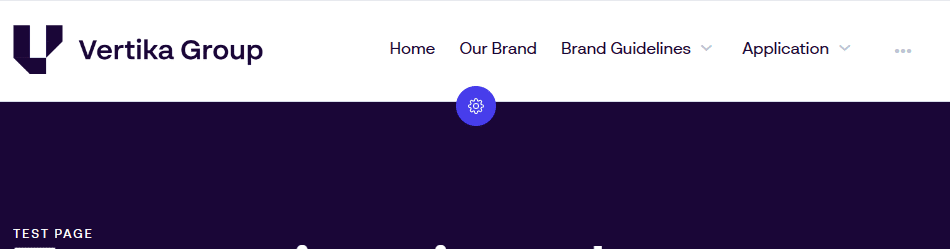
Navigation bar (Top)
The navigation component is where users navigate to get to pages. It also displays the logo and have options to direct users to a search area (Dam view).
Navigation comes in two variations. Top navigation and Left navigation.
Overview
Top navigation is the current typical way of displaying navigation. For many, this resembles more how navigation is done on the web and it comes with a few more display and configuration options.
- Logo: Company logo. Can be shown on left or right side
- Navigation (menu items): Navigation to all published pages visible to the user
- Drop-down (arrow pointing down): If the top page have more pages under it, this drop-down appears
- Overflow (three dots): All pages not fitting on the navigation gets listed here
- Configure (cogwheel): Click here to configure the navigation bar
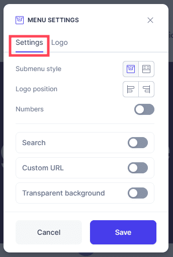
General settings for top navigation
- Settings: One out of two tabs. Settings is for the top navigation panel.
- Submenu style: Choose if navigation drop-down should use the “single column” style or the “full width” style.
- Logo Position: Position the logo to the left or to the right. Navigation adjusts acordingly
- Numbers: All navigation items will have a number to help elevate the structure and readability
- Search: Enable the search button. Clicking this will lead to a search page (place view component) (must select a resulting search page when configuring)
- Custom URL: Decide what happens if you click the logo. Default behaveour is to lead back to the “home” page in this portal
- Transparent background: Navigation can be placed on top of the header carousel. This feature requires logos to be set up in the “logo” tab in this configuration window
- Save: Save all changes. When clicking save, all changes done will go live immediately. Everything except “transparent background” will apply to all pages using “top navigation”
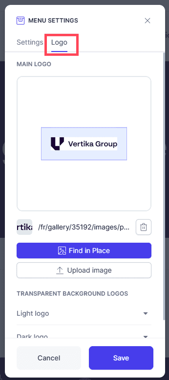
General logo settings for top navigation
- Logo: In this tab you can manage all logos used in the portal. Changes done will apply to all pages using “top navigation” when clicking save.
- Main logo: This is the primary logo which will appear on every page using “top navigation”
- Space: Drag and drop the blue bar to define how much space should be around the logo. You can also click the appering number and type a value
- Remove: Remove current logo
- Find in Place: Open the Place pop-up and select a new logo from your archive
- Upload image: Upload a new logo into the archive and immediately use here. Recommended workflow is to upload into archive first, then use the above button to pick
- Transparent background logos: You can define what logos should be used with the “transparent background” option in the previous tab. It is important to select logos which contrasts well to ensure visibility