Our new Toolbar
Introducing our UX / UI leap forward
When we launched the all-new Papirfly Platform – the result of a year-long program of unifying our 32 products and more than 300 services – on 1 November we introduced a whole new UX and UI.
We set out to deliver a refined User Experience (UX) when launching Papirfly Platform, seeking to make it easier than ever to get the most out of our software’s deep and broad capabilities. With hundreds of possible tasks, actions, and features in one unified product a priority was always going to be helping users find their way around.
At the same time, we were excited to release our latest User Interface (UI) design too. Something our award-winning design team based in Czechia – soon to be featured in Bohemian Identity TV Series mapping the most influential Czech graphic designers of the 21st century – had been working on throughout 2023. Pushing hard on design innovation, adopting our own Design System, and ensuring a clean, accessible, and universal look and feel was key.
Combining the promises of our new UX and UI, we created the perfect moment to launch a whole new way of navigating around all of our products. User research, design prototyping, market analysis, and product testing all pointed us towards one solution…the introduction of Toolbar.

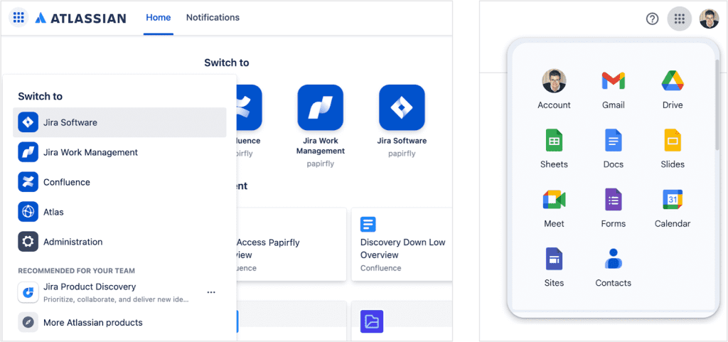
In truth, Toolbar is – of course – not a revolution. Indeed it’s a SaaS (Software as a Service) staple. When you use Google, Workspace, Microsoft 365, WordPress, Atlassian, Hubspot, or MailChimp you navigate using a similar toolbar. They can look different, they might appear in different places, and they vary from the minimal (like ours) to full feature ‘ribbons’ like we’re used to in the likes of Word.

We wanted to evolve the concept of a toolbar and focus on usability. As of 1 November, our Papirfly Platform users now have access to all of the products included with their subscription in one place. This puts Brand Guidelines, Digital Asset Management, On-Brand Templating, Marketing Campaign Execution, and Enterprise-Grade Analytics all in one powerful tool.
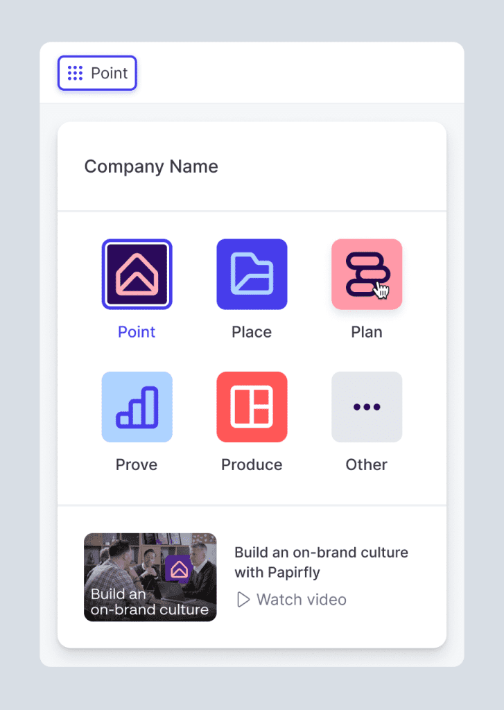
Being able to switch between products quickly, easily, and intuitively was essential. Which is why we launched the app switcher within Toolbar.
We spent a lot of time making sure it was visible enough when it was required but something that also then blended into the background when our users were focusing on the product they were using. Getting this mix of ‘obvious yet unobtrusive’ just right was a critical part of the project.

The app switcher also allows us to help users see more of Papirfly Platform than they are used to using. Encouraging users to use all of the tools they have access to is important to us because it’s important to our customers. The more they utilise Papirfly Platform for its strengths in brand management, the more consistently they stay on brand when creating content, designing collateral, or planning campaign activity. Our app switcher, within Toolbar, helps users explore all of the tools available to them – including trying new products and features.
We decided to adopt the same feature rollout plan as our larger SaaS cousins and make Toolbar available to everyone. We could have restricted it to specific user groups (admin users, for example), delivering a different UX for different groups of people. We listened to our users, analysed support tickets, spoke to customer groups, and examined best practice in this space before concluding that our own approach to brand, design, and experience meant – of course – we wanted to deliver a consistent, cohesive, and singular UX.
Now, whether you are a user with admin-rights, a standard user who logs in every day, or a ‘view only’ team member only accessing parts of Papirfly Platform occasionally the UX is the same, always.
This helps our Product Enablement team work with customers on product knowledge and education in a more engaging way. It helps our customers encourage their people to get the most out of the tools they have access to. And it aids users through better support, documentation, and community. It also allows our Product team to concentrate on platform-wide innovation which ultimately delivers stronger features, enhances product roadmaps, and creates better visibility of what’s coming next across all of our products.
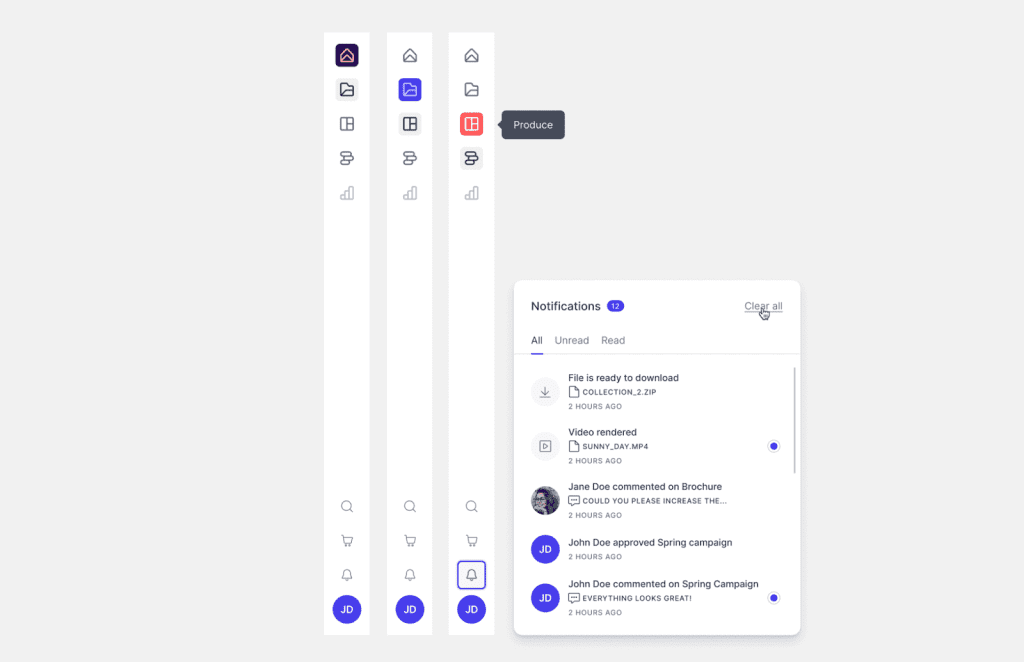
In addition to the app switcher, Toolbar gives a number of other options to users. Providing feedback is quick and simple, directly from within Toolbar, allowing the ability to suggest new product ideas, request new features, and make suggestions which all go directly to our Product team. It’s easier than ever to manage notifications with every alert in one place – with lots of exciting updates to notifications coming in 2024. Finally, Toolbar is home to users’ preferences, their collections, their creatives, and their own user profile.
All of this allows everyone to spend less time looking for things, puts the focus back on customers empowering their people, and gives users more time to focus on unleashing their brand.
We hope you love using Toolbar and it enhances your day-to-day experience of Papirfly Platform. With more than 50 innovations planned for 2024 there’s plenty still to come. We’ll update users on everything that is new via notifications which are to be found on…Toolbar.