Point
Educate & Control
Version 0.1
Background
Purpose
Use case
-
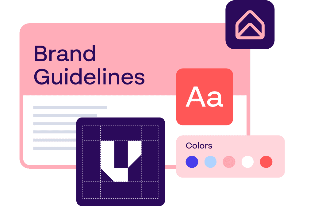
One central tool for an organisation where emploees - and everyone else who will use the brand - can learn and apply every aspect of the brand.
-
Access all branded assets in your DAM, branded templates, campaigns - and all other brand management services
-
With our intuitive layout editor (WYSIWYG), admin users can create and edit sub-pages and subportals with predefined templates and out-of-the-box design elements.
Versioning
Age
-
1 year released in 2023
Newest Release
-
Version 0.3, released December 2023
Oldest Release
-
Version 0.1, May 2023
R&D
Previously
-
Brand Hub, Brand portal
Incorporating
-
Place, Produce, Plan, Prove
Innovation Roadmap
-
Initiatives: Major projects and innovation themes we have committed to deliver
-
Epics: Cluster of R&D tasks that will turn our initiatives into reality
Ecosystem
Parent
-
Papirfly Product Suite
Interoperality
-
Point allows users to access and build in services from rest of the Papirfly suite in one central hub
User
Interface
-
Papirfly Product Suite
Accessability
-
Designed and developed with WCAG 2 guidelines in mind
Responsiveness
-
Currently suitable for standard computer screens and resolutions, not currently mobile/tablet compatible
Languages
-
English, German, French, Italian, Spanish, Portuguese, Dutch, Norwegian, Swedish, Danish, Polish, Czech, Slovakian, Hungarian, Romanian and Greek.
Services
CMS System
Top navigation
-
Navigate the site with menu on top
Left navigation
-
Navigate the site with menu left
Header carousel
-
Highlight campaigns or other relevant material in a Hero image or video carousel. (Can be one or multiple). Each Hero can be modified individually with CTA button, text. Transitions between slides are defined in compmonent.
Tiles
-
Visual way of presenting links. Multiple layout and animation options.
Breadcrumb navigation
-
Display a breadcrumb of the pages location in the site, and navigate horisontally to other pages on the same level
Inline pages
-
Use the inline option to split up information on a single page. Inline pages allow users to incorporate sub-pages as dropdown menu on the same page.
Quicklinks
-
Similar to tiles, but takes much less space. Quickly link to important pages and downloads in your site
Chapter navigation
-
Navigation component that lets you navigate to the next page on the same level in site hierachy.
Anchor Component
-
Creates an anchor navigation section that sticks to top. Eases in page navigation for long pages
Footer
-
Standarise the footer of each page. Comes i two different variants. Footer and extended footer.
DAM view
-
Display a section of yor DAM. Define how many assets should be initially shown. Define which DAM(s) to be included, if they have a locked initial search, which type of assets (regular assets, Hub pages and orderable items) should be displayed, Choose which filters the end user should receive
WYSIWYG Editor
-
Used for creating any page content. Work in sectons with either presetted number of columns or columns defined by user. Each column again consist of on or more blocks of content. Each block can be of various type: Text, Image, Video, FAQ, Template, Slideshow, Grid of assets, Graphs, Color Swatches, Graphs, Design system Component
Papirfly template widget
-
Display papirfly templates and creatives made using this templates. Control wich templates that is accessible in the widget, and which user groups can do which operations on the creative.
Page Admin
Page builder
-
Build sitemap, define who has access to different branches and pages in the site. Manage translations of site. Define look for pages when found in search results and how they are presented in Social Media. Define if pages are open, searchable and define dates for when the page should automatically publish/unpublish
Template editor
-
Create page templates based on the components defined in previous section
Design system
Figma integration
-
Connect your design system to a design source in Figma
Storybook integration
-
Connect your design system to one or multiple storybooks, depending on your companys frameworkpolicy
Components library
-
Connect Figma components to their corresponding story. Document components using standard Brand Hub components, and the specific "Component" widget
Global toolbar
Module navigation
-
Navigate through the different Papirfly Modules available to your user
UI Builder
General settings
-
Define the general setting for layout, grid size gutter size, colors, shadows, typography, icons, logo
Brandbook components
-
Define the appearance of the individual components listed under CMS System above
Integrations
Internal
-
Place
-
Prove
-
Plan
-
Produce
Build
Frontend
Languages
-
Javascript
Frameworks
-
Angular
Backend
Languages
-
PHP
Frameworks
-
Nette
Tech information
Hosting
-
AWS Cloud hosting
Database
-
Aurora MySQL
Storage
-
S3 Bucket
Logging
-
CloudWatch
Event logging
-
Sentry
Deployment
-
Bitbucket Pipelines
Backend APIs
-
API Gateway
DNS
-
Route53
Deployment Process
-
Bitbucket Pipelines
Knowledge
Documentation
Product pages
-
https://www.papirfly.com/point/
How-to-guide
-
https://www.papirfly.com/knowledge-base-point/
FAQ's
-
http://www.papirfly.com/faq