Resources

Knowledge base

Gathering cookies

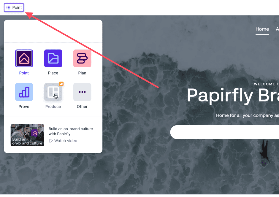
Where does it appear?

The cookie prompt will appear in Point, Place, Prove, Produce and Plan. Papirfly remembers your answers, and will reappear once every year to ensure you still want to comply to the collection of data.

In order to be compliant with the EU GDPR legislation, Papirfly is required to have a cookie banner and link to privacy policy. The cookie banner is necessary as we are using non-essential/unnecessary cookies that requires consent from our users.
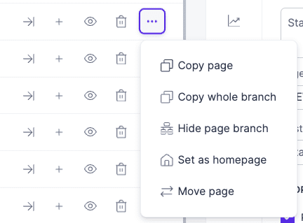
Users have the following options:

  • Accept = You accept all cookies
  • Reject = You only accept necessary cookies, and reject unnecessary ones. You will not be able to reject all cookies as they are deemed important to the usage of Papirfly.
  • Manage cookies: Gives the the possibility to choose which cookies we should collect. The options are: Necessary, Performance and Preference.

You are able to adjust the settings after you have already decided. To do this, click on the user symbol in the upper right corner of the platform, Followed by Cookies under Privacy. This will allow you to change the preferences of the cookies if you decided earlier.

Resources

Knowledge base

Customise a page

Point allows you to customise your pages to your needs. There are several elements and modules that can be used to create pages.

Pages needs to be customised separately. To customise a page, follow these steps:

  1. Open page admin
  2. Navigate to the page you would like to edit
  3. Enable edit mode (this requires special access)
  4. On the page, start adding elements by clicking on the + signs on the different areas inside the page. This will allow you to add new modules onto the page.
  5. As soon as you are done editing, make sure you click the Save button (disc icon) in the floating bar.
  • Please note that the modules you are allowed to use on a specific page relies on which page template has been applied to the page. To learn more about page templates, click here.

Resources

Knowledge base

The Page template builder

The page template builder allows you to update and manage the templates used on each page in your portal.

It is also important to not create too many different page templates. A measured few templates ensures a consistent look and feel to the portal

  • Please note, very few users are able to access the Page template builder. It is controlled by access rights.
Page template builder

The Page template builder lets you create your own predefined set of page layouts. The Page template builder is accessible here:

Resources

Knowledge base

Page settings

Page admin has many options for you to manage your pages. Here is a description of the different options.

Page settings

In the overview of Page admin, you can also adjust the settings of each page by clicking on a specific page. The settings for each page can be found here:

Additional page settings

There are more settings for each page that you can explore. To find more options such as page permissions, categories, activity and more, utilise this menu:

Page template builder

The Page template builder lets you create your own predefined set of page layouts. The Page template builder is accessible here:

Resources

Knowledge base

Page admin buttons

Page admin has many options for you to manage your pages. Here is a description of the different options.

Quick actions

These actions give you access to some smart and practical options that you can use for the pages in the overview. You can find these actions here:

  • Drag and drop: Use drag-and-drop to move pages
  • Page icon: Clicking on the icon, page name or anywhere in the open space, opens the right side menu to edit settings for the page.
  • Status: Shows status of the page. If page has expired (date setting), this status changes.
  • Open page: Go to the selected page
  • New nested page: Clicking this will start the process of creating a new sub page. Completing the setup will create the new page under this one. Using this option will inherit the visibility (user group access levels).
  • Hide page: Clicking this will immediately unpublish the page. This will prevent users from accessing the page, and it disappears from navigation.
  • Delete page: Clicking this will delete the page
  • More options: Several options are hidden under here. Copy page will clone the page and place it directly under. Copy whole branch will clone this page and all pages under it. Show or hide page branch will hide all pages under it from navigation. Set as home page makes this the new HOME page. Pages are still accessible if you link to it. Move page lets you move the page to a different page hierarchy.

Resources

Knowledge base

Adding new files

  • Adding new files into Design systems can only be done from Figma

Design systems allows you to link as many Figma files as you want. This lets you customise your design element pages to your liking by combining files from different projects in Figma.

To learn more about Design systems, check this article.

Adding/linking files from Figma

To add new files from Figma, follow these steps:

  1. Click on Design systems in the floating menu in Point
  2. In the new window, click on Link file
  3. Paste the URL to the Figma file in the new window and click Link file
  4. The file has now been added to Design systems
  • Keep in mind that, for the file to be successfully linked, you need to be logged in on Figma and have access to the file on your user.

Resources

Knowledge base

Introduction

Papirfly’s Design systems enables you to seamlessly integrate all your design elements and components into Point, making it quick and easy for your users to find the material they need.

Where can I find Design systems?
  • You need to have to access the floating menu in Point to access Design systems

The feature can be located in the floating menu inside Point. Clicking on Design systems will open a new window where you will be able to connect and document your design elements/components.

Resources

Knowledge base

Navigation bar (Top)

The navigation component is where users navigate to get to pages. It also displays the logo and have options to direct users to a search area (Dam view).

Navigation comes in two variations. Top navigation and Left navigation.

Overview

Top navigation is the current typical way of displaying navigation. For many, this resembles more how navigation is done on the web and it comes with a few more display and configuration options.

  • Logo: Company logo. Can be shown on left or right side
  • Navigation (menu items): Navigation to all published pages visible to the user
  • Drop-down (arrow pointing down): If the top page have more pages under it, this drop-down appears
  • Overflow (three dots): All pages not fitting on the navigation gets listed here
  • Configure (cogwheel): Click here to configure the navigation bar
General settings for top navigation
  • Settings: One out of two tabs. Settings is for the top navigation panel.
  • Submenu style: Choose if navigation drop-down should use the “single column” style or the “full width” style.
  • Logo Position: Position the logo to the left or to the right. Navigation adjusts acordingly
  • Numbers: All navigation items will have a number to help elevate the structure and readability
  • Search: Enable the search button. Clicking this will lead to a search page (place view component) (must select a resulting search page when configuring)
  • Custom URL: Decide what happens if you click the logo. Default behaveour is to lead back to the “home” page in this portal
  • Transparent background: Navigation can be placed on top of the header carousel. This feature requires logos to be set up in the “logo” tab in this configuration window
  • Save: Save all changes. When clicking save, all changes done will go live immediately. Everything except “transparent background” will apply to all pages using “top navigation”
General logo settings for top navigation
  • Logo: In this tab you can manage all logos used in the portal. Changes done will apply to all pages using “top navigation” when clicking save.
  • Main logo: This is the primary logo which will appear on every page using “top navigation”
  • Space: Drag and drop the blue bar to define how much space should be around the logo. You can also click the appering number and type a value
  • Remove: Remove current logo
  • Find in Place: Open the Place pop-up and select a new logo from your archive
  • Upload image: Upload a new logo into the archive and immediately use here. Recommended workflow is to upload into archive first, then use the above button to pick
  • Transparent background logos: You can define what logos should be used with the “transparent background” option in the previous tab. It is important to select logos which contrasts well to ensure visibility

Resources

Knowledge base

Creating a new page template

Page admin lets you manage all of your pages within Point, giving you all the tools you need to make changes to all pages within the same window.

Creating new page templates
  1. Open page admin
  2. In the page overview, click on Page template builder in the upper right corner, and a new area inside page admin will open
  3. In this area, click on + New template and a new window will appear
  4. In this window, give the template a name and click create
  5. You will now have an empty template that you can utilise to create your own template. In order to build your own, find the modules you would like to use in the right hand sidebar (content, Navigation, Header, Integrations and Footer) and click-and-drag the modules into the field in the middle to build your own page template
  6. As soon as you are done customising your own Page template, click on Save template in the upper right corner
  7. You have now created your own page template. Now, remember to activate it by selecting it when editing a specific page

Gif on how to create a new page template (expect some loading time):

Resources

Knowledge base

Editing existing pages

Page admin lets you manage all of your pages within Point, giving you all the tools you need to make changes to all pages within the same window.

Editing existing pages

To edit an existing page, follow these steps:

  1. Open page admin
  2. In the page overview, click on the specific page you would like to edit and a new area will open in the right hand sidebar
  3. Edit the information of the page in the right hand sidebar
  4. Click save when you are done editing
  5. You have now edited an existing page

The screenshot below shows where to click to start editing an existing page:

Gif on how to edit an existing page (expect some loading time):

Resources

Knowledge base

Creating a new page

Page admin lets you manage all of your pages within Point, giving you all the tools you need to make changes to all pages within the same window.

Creating a new page

To create a new page in page admin, follow these steps:

  1. Open page admin
  2. Click on the button called + New page above the page overview
  3. Fill in the details of the new page and finish by clicking on Create new page
  4. You have now created a new page

The screenshot below shows where to click to start creating a new page:

Gif on how to create a new page (expect some loading time):

Resources

Knowledge base

The Carousel component is a great way to show of news, campaigns or to have a welcome image on a page.

In Edit mode you can gain access to carousel options by clicking the cogwheel underneath it.

General settings

The options for the carousel are:

  • Slides: List of all the different slides in this banner. If you have multiple slides, you can then have these animate and show different content
  • Add new: Click add new to add additional slides.
  • Display: Allows to select between normal header carousel with support for multiple slides OR Search. If search is enabled, you can select a pre-made search page (PLACE view) as a search result page.
  • Size: The carousel comes in 3 sizes.
  • Animation time: If you have multiple slides, you can decide how long one slide is visible before moving over to the next.
  • Animation type: If you have multiple slides, you can decide what animation type is used to transition between slides.
  • Save: Clicking this will publish any changes you have done.
  • Background: You can select background color, image or video to display for each slide. Remember to use web optimised imagery so loading times do not increase.
  • Focus: If you use an image or a video, you can then decide “focus”. If for example someone views the page on a phone, the banner might be cropped and you can decide where the “focus point” is on the image.
  • Header: This is the large title on the banner
  • Sub header: Smaller sub header text
  • Additional text: You may add an additional block of text onto the banner.
  • Link: Add a link to external or internal content and a button will appear on banner
  • Inverse: Inverts the color on text and button. Used for contrast.
  • Duplicate: Duplicates the banner so you can quickly make an alternate version
  • Delete: Deletes the banner (only this one slide)
  • Save: Remember to save your changes.

Resources

Knowledge base

Navigation bar (left)

The navigation component is where users navigate to get to pages. It also displays the logo and have options to direct users to a search area (Dam view).

Navigation comes in two variations. Top navigation and left navigation.

Overview

Left navigation is often used in documentation heavy setups where you want it to look like the index of a book.

  • Search: Define a search page. Add a search inquiry here and display the result on the linked search page (Dam view).
  • Navigation links: Items visible in navigation is managed trough “page admin”. Use the “drop down” arrows to expand and show more content.
  • Configure (cogwheel): Cogwheel opens an editor interface where you can change the look and feel of the navigation. This cogwheel only appears while in “edit mode”. Read more on this below.
Editing settings for left navigation

Clicking the configure button (cogwheel) opens a view where you can configure various settings of the navigation panel. Note that this panel applies changes to general look and feel. To manage page visibility and what items are in the navigation, you do this in the “page admin”

Keep in mind, Changes you do may affect all pages in the portal.

  • Numbers: Adds a number to all pages to help show the different levels. Top level is 1. First sublevel is 1.1 etc.
  • Search: Enabling this, displays a search box in navigation. Connect this to an existing search page (Dam view). Users entering a search will be forwarded to this page with their search prefilled.
  • DAM View Page: If search is enabled, make your result page selection here. Page must be pre created with “DAM view” component.
  • Custom URL: Logo in navigation will link to this location. If this remains empty, clicking the logo will send users to the current “home” page in the portal.
  • Main logo: Select which logo you wish to display on the navigation pane.
  • Spacer: If you hover your mouse over this line, you can manually alter the space around it in navigation.
  • Logo picker: Two options to select what logo to display. Find in PLACE opens the archive where you can find your already uploaded logo. “Upload” allows you to upload a logo to display here. We recommend uploading the logo into archive first, then selecting a logo. Ensures you manage file size, placement and version.
  • Update: Clicking update will publish the changes into portal immediately.

Resources

Knowledge base

Clearing cache

Clearing your browser cache

Clearing cache helps improve device performance and free up storage space by removing temporary files and outdated information.

In Papirfly terms, clearing your cache is most often a topic that comes up whenever you are struggling accessing or seeing something within the product. Examples of this would be issues with logging in or maybe you are not seeing a new button within the product. Clearing the cache might solve both of these issues.

Clearing cache is done differently in every web browser. See instructions below to learn how to clear cache in your specific web browser.

Clearing cache – Google Chrome:
  1. Open Chrome: Launch the Google Chrome browser on your computer.
  2. Access Settings: Click on the three dots in the top-right corner (menu icon), then select “Settings.”
  3. Expand Advanced Settings: Scroll down to the bottom and click on “Advanced” to expand the settings.
  4. Clear Browsing Data: Under “Privacy and security,” click on “Clear browsing data.”
  5. Choose Data to Clear: Select the types of data you want to delete (e.g., “Browsing history,” “Cookies and other site data,” “Cached images and files”).
  6. Select Time Range: Choose the time range (e.g., “Last hour,” “Last 24 hours,” “All time”).
  7. Clear Data: Click “Clear data.”
Clearing cache – Mozilla Firefox:
  1. Open Firefox: Launch the Mozilla Firefox browser.
  2. Access Settings: Click on the three horizontal lines (menu icon) in the top-right corner and select “Options.”
  3. Privacy & Security: In the left-hand menu, scroll down to “Privacy & Security.”
  4. Clear Data: In the “Cookies and Site Data” section, click on “Clear Data.”
  5. Choose Data to Clear: Select the types of data you want to delete (e.g., “Cookies,” “Cached Web Content”).
  6. Clear Data: Click “Clear.”
Clearing cache – Safari:
  • (Note: These instructions are for Safari on macOS. If you’re using Safari on iOS, the process is slightly different.)
  1. Open Safari: Launch the Safari browser.
  2. Access Preferences: Click on “Safari” in the menu bar, then select “Preferences.”
  3. Privacy: Go to the “Privacy” tab.
  4. Manage Website Data: Click on “Manage Website Data.”
  5. Remove All: To remove all website data, click “Remove All.” To remove specific data for a website, search for the site and select it, then click “Remove” or “Remove All.”
Clearing cache – Microsoft Edge:
  1. Open Edge: Launch the Microsoft Edge browser.
  2. Access Settings: Click on the three horizontal dots (menu icon) in the top-right corner and select “Settings.”
  3. Privacy, Search, and Services: In the left-hand menu, click on “Privacy, search, and services.”
  4. Clear Browsing Data: Scroll down to the “Clear browsing data” section and click on “Choose what to clear.”
  5. Choose Data to Clear: Select the types of data you want to delete (e.g., “Browsing history,” “Cookies and other site data,” “Cached images and files”).
  6. Clear Data: Click “Clear.”

Remember to exercise caution when clearing browser data, as it will log you out of websites and may remove some saved preferences.

Resources

Knowledge base

URLs to Papirfly

What is a URL?

A URL, or often referred to as links, is defined as the following: “A URL is nothing more than the address of a given unique resource on the Web“.

In Papirfly terms, a URL takes you to the specific product that you are looking to use; Point, Place, Produce, Plan or Prove. Examples of this can be seen below.

Papirfly URLs

It contains https://app.papirfly.com/product + /xxxxx the ID (number) of your portal. See list below for every single link to the different products in the Papirfly Product suite.

  • Point: https://app.papirfly.com/point/xxxxx
  • Place: https://app.papirfly.com/place/xxxxx
  • Produce: https://app.papirfly.com/produce/xxxxx
  • Plan: https://app.papirfly.com/plan/xxxxx
  • Prove: https://app.papirfly.com/prove/xxxxx

Keep in mind that the links above are not meant for use. They are only examples as they are missing the ID of the portal at the end of the link. The ID is always unique to your Papirfly product.

Resources

Knowledge base

Navigating to other Products

Navigating

Click here to see a video on how to navigate between products

Navigating to other products within Papirfly is easy. All you have to do is to click on the icon with the 9 dots in the upper left corner and a new window with all available products will appear. Then, click on the product you would like to go to.

The button called Other contains more options for you to navigate to, such as Marketplace.

Previewing unavailable products

The products that have a coloured icon are the ones that are available to you. The ones with a grey colour are products that you currently do not have in your license with Papirfly.

By clicking on the grey icon of the products you currently do not have you can get a quick preview of what the product is.

Video on how to navigate

Resources

Knowledge base

Forgotten password

If you have forgotten your password, click on Generate new password in the window where you enter your username and password on the login page. 

Resources

Knowledge base

Logging in

Logging in is simple. Go to the URL provided and enter your username and password. If you have forgotten your password, click on Generate new password

Resources

Knowledge base

About Page admin

Page admin allows you to create and configure pages in Point.

Manage visibility, access, components on pages and more. You are also able to publish, un-publish and see the complete history of changes done to each page in the hierarchy.

Page admin is an elevated access right and is most often only assigned to a small number of users.

Accessing Page admin

Page admin is found in the floating menu inside Point, as shown in the screenshot below:

Page admin menu

Pages are the actual pages that the end-user will see as they are using Point. Inside Page admin, pages can be found and managed as seen below:

Quick page actions

These actions function as quick options for you to quickly make adjustments to specific pages. These actions are located to the right of the pages in the page admin menu, as seen below:

Explanation for each quick action:

Open page: Go to the selected page

New nested page: Clicking this will start the process of creating a new sub page. Completing the setup will create the new page under this one. Using this option will inherit the visibility (user group access levels).

Hide page: Clicking this will immediately unpublish the page. This will prevent users from accessing the page, and it disappears from navigation.

Delete page: Clicking this will delete the page

More options: Several options are hidden under here. Copy page will clone the page and place it directly under. Copy whole branch will clone this page and all pages under it. Show or hide page branch will hide all pages under it from navigation. Set as home page makes this the new HOME page. Pages are still accessible if you link to it. Move page lets you move the page to a different page hierarchy.

Page settings

In the overview of Page admin menu you can also adjust the settings of each page by clicking on a specific page. The settings for each page can be found here:

Additional page settings

There are more settings for each page that you can explore. To find more options such as page permissions, categories, activity and more, utilise this menu after you have clicked on a specific page:

Resources

Knowledge base

Editing text (WYSIWYG)

The text editor allows you to edit text in the portal. The editor provides you with a toolbar that provides you with all the text editing tools that you need.

What it looks like

The text editor (WYSIWYG) is similar to other text editing tools out there. In Papirfly, it is a bar that is located above the textbox that you are currently editing. This is what it looks like:

Different buttons/functions within the toolbar

Here is a short explanation to each button/function within the toolbar:

  • Styles (drop-down): Choose between different paragraph styles, notably the size of the text. The alternatives are predefined.
  • Normal (drop-down): Similar to styles, choose the sizing of the text Very useful if the text in question is a header and you need to choose a different size. The alternatives are predefined.
  • B: Bold text. Lets you make your selection of text into bold
  • I : Italic text. Lets you make your selection of text into italic
  • Numbered list: Make a numbered list. Very useful for making step-by-step guides.
  • Bullet point list: Make a list with bullet points (dots). Very similar to how you would make a shopping list with no prioritised order.
  • Quote (chat bubble): Add a quote inside the textbox. Very useful for quotations.
  • Text position (left, middle, right): Decide where the text should be positioned within the textbox.
  • Hyperlink: Add a link to another page. To use this, mark the text you would like to add a hyperlink to and press the button. This will open a new window for adding the URL.
  • Arrows: Just like the text positioning above, this allows you to quickly move the text to where you want it to be positioned inside the textbox.
  • Text settings: Adjust the colour of the text
  • Text background settings: Adjust the text highlight or background

Resources

Knowledge base

Adding a Place viewer into Point

The Place viewer lets you access your Place assets directly from Point, making it much easier for you to find and download your assets.

What it looks like

As you already know, Place has its own separate landing page. However, in our day-to-day work we often just need to get specific assets from our media bank as quickly as possible.

To help you out with this, we have a plugin that allows you to view your Place archive directly from Point. This allows you to find your images and download them.Keep in mind that if you want to have all options for administering assets available, you still need to head over to Place.

Add the Place viewer into your Point

To add this view into your own Point you first need to ensure that you have access rights to edit the portal. When you are ready, follow these steps:

  1. Ensure that you are in Point
  2. Click on Page admin in the floating options bar and a pop-up will appear
  3. In the pop-up, click on + New Page above the page overview
  4. In the right hand sidebar under page settings, add the details of your new page (name, description etc.)
  5. Now, in order to make this page a Place viewer, click on the pen icon under Page template in the page settings window. This allows you to edit the content of the page
  6. In this window, click on + New Template and you will get a fresh page type to customise to your liking
  7. In the right hand sidebar under components, click on integrations
  8. Take the component called Place view and drag it into the template type builder as seen below

  1. Click Save template in the upper right corner
  2. Make sure that this new template is used on the new page you created in step 3, and save the page
  3. The page should now have the Place viewer activated on the page. All you need to make sure to have it in Point is that the page is possible to navigate to through the menu
  4. You have now activated the Place viewer.
Options within the Place viewer
  • Categories: Find your assets by choosing the categories containing the types of assets you are looking for
  • Filters: Narrow down the assets that you see by choosing filters, such as extension (png, jpg, PDF and more) and asset type (Image, document, archive)
  • Actions: Lets you choose an action for the assets that you have selected (download, share and add to collection)
  • Sorting: Choose the order of the assets in the overview (oldest, newest, a-z and more)