Resources
Knowledge base
Header/Carousel
The Carousel component is a great way to show of news, campaigns or to have a welcome image on a page.
In Edit mode you can gain access to carousel options by clicking the cogwheel underneath it.
General settings
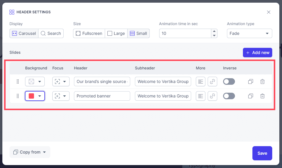
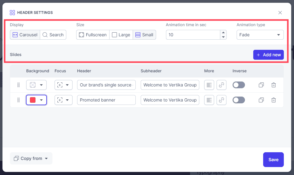
The options for the carousel are:
- Slides: List of all the different slides in this banner. If you have multiple slides, you can then have these animate and show different content
- Add new: Click add new to add additional slides.
- Display: Allows to select between normal header carousel with support for multiple slides OR Search. If search is enabled, you can select a pre-made search page (PLACE view) as a search result page.
- Size: The carousel comes in 3 sizes.
- Animation time: If you have multiple slides, you can decide how long one slide is visible before moving over to the next.
- Animation type: If you have multiple slides, you can decide what animation type is used to transition between slides.
- Save: Clicking this will publish any changes you have done.
Settings for specific images in the carousel/header
- Background: You can select background color, image or video to display for each slide. Remember to use web optimised imagery so loading times do not increase.
- Focus: If you use an image or a video, you can then decide “focus”. If for example someone views the page on a phone, the banner might be cropped and you can decide where the “focus point” is on the image.
- Header: This is the large title on the banner
- Sub header: Smaller sub header text
- Additional text: You may add an additional block of text onto the banner.
- Link: Add a link to external or internal content and a button will appear on banner
- Inverse: Inverts the color on text and button. Used for contrast.
- Duplicate: Duplicates the banner so you can quickly make an alternate version
- Delete: Deletes the banner (only this one slide)
- Save: Remember to save your changes.