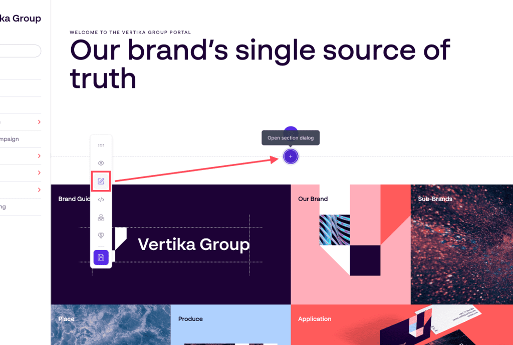
Point allows you to customise your pages to your needs. There are several elements and modules that can be used to create pages.
Pages needs to be customised separately. To customise a page, follow these steps:
Open page admin
Navigate to the page you would like to edit
Enable edit mode (this requires special access)
On the page, start adding elements by clicking on the + signs on the different areas inside the page. This will allow you to add new modules onto the page.
As soon as you are done editing, make sure you click the Save button (disc icon) in the floating bar.
Please note that the modules you are allowed to use on a specific page relies on which page template has been applied to the page. To learn more about page templates, click here.
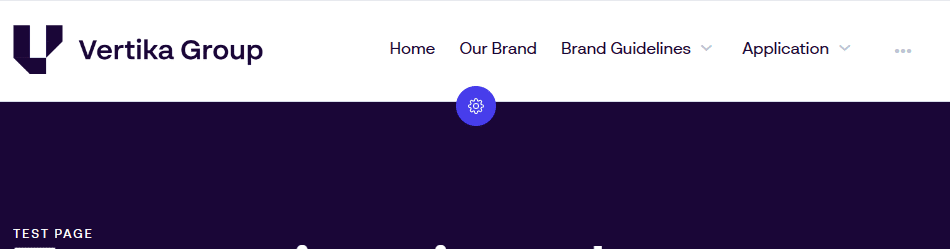
The navigation component is where users navigate to get to pages. It also displays the logo and have options to direct users to a search area (Dam view).
Navigation comes in two variations. Top navigation and Left navigation.
Overview
Top navigation is the current typical way of displaying navigation. For many, this resembles more how navigation is done on the web and it comes with a few more display and configuration options.
Logo: Company logo. Can be shown on left or right side
Navigation (menu items): Navigation to all published pages visible to the user
Drop-down (arrow pointing down): If the top page have more pages under it, this drop-down appears
Overflow (three dots): All pages not fitting on the navigation gets listed here
Configure (cogwheel): Click here to configure the navigation bar
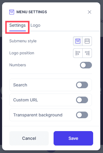
General settings for top navigation
Settings: One out of two tabs. Settings is for the top navigation panel.
Submenu style: Choose if navigation drop-down should use the “single column” style or the “full width” style.
Logo Position: Position the logo to the left or to the right. Navigation adjusts acordingly
Numbers: All navigation items will have a number to help elevate the structure and readability
Search: Enable the search button. Clicking this will lead to a search page (place view component) (must select a resulting search page when configuring)
Custom URL: Decide what happens if you click the logo. Default behaveour is to lead back to the “home” page in this portal
Transparent background: Navigation can be placed on top of the header carousel. This feature requires logos to be set up in the “logo” tab in this configuration window
Save: Save all changes. When clicking save, all changes done will go live immediately. Everything except “transparent background” will apply to all pages using “top navigation”
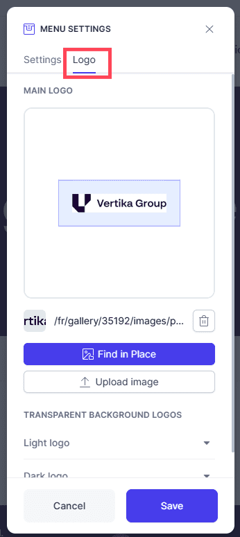
General logo settings for top navigation
Logo: In this tab you can manage all logos used in the portal. Changes done will apply to all pages using “top navigation” when clicking save.
Main logo: This is the primary logo which will appear on every page using “top navigation”
Space: Drag and drop the blue bar to define how much space should be around the logo. You can also click the appering number and type a value
Remove: Remove current logo
Find in Place: Open the Place pop-up and select a new logo from your archive
Upload image: Upload a new logo into the archive and immediately use here. Recommended workflow is to upload into archive first, then use the above button to pick
Transparent background logos: You can define what logos should be used with the “transparent background” option in the previous tab. It is important to select logos which contrasts well to ensure visibility
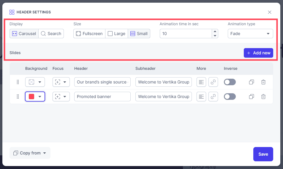
The Carousel component is a great way to show of news, campaigns or to have a welcome image on a page.
In Edit mode you can gain access to carousel options by clicking the cogwheel underneath it.
General settings
The options for the carousel are:
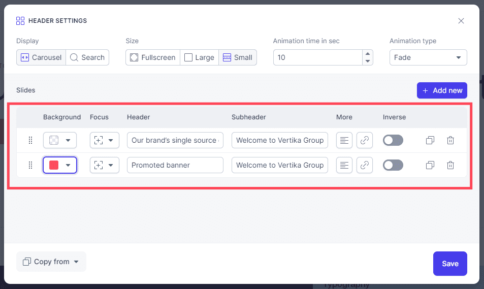
Slides: List of all the different slides in this banner. If you have multiple slides, you can then have these animate and show different content
Add new: Click add new to add additional slides.
Display: Allows to select between normal header carousel with support for multiple slides OR Search. If search is enabled, you can select a pre-made search page (PLACE view) as a search result page.
Size: The carousel comes in 3 sizes.
Animation time: If you have multiple slides, you can decide how long one slide is visible before moving over to the next.
Animation type: If you have multiple slides, you can decide what animation type is used to transition between slides.
Save: Clicking this will publish any changes you have done.
Settings for specific images in the carousel/header
Background: You can select background color, image or video to display for each slide. Remember to use web optimised imagery so loading times do not increase.
Focus: If you use an image or a video, you can then decide “focus”. If for example someone views the page on a phone, the banner might be cropped and you can decide where the “focus point” is on the image.
Header: This is the large title on the banner
Sub header: Smaller sub header text
Additional text: You may add an additional block of text onto the banner.
Link: Add a link to external or internal content and a button will appear on banner
Inverse: Inverts the color on text and button. Used for contrast.
Duplicate: Duplicates the banner so you can quickly make an alternate version
The navigation component is where users navigate to get to pages. It also displays the logo and have options to direct users to a search area (Dam view).
Navigation comes in two variations. Top navigation and left navigation.
Overview
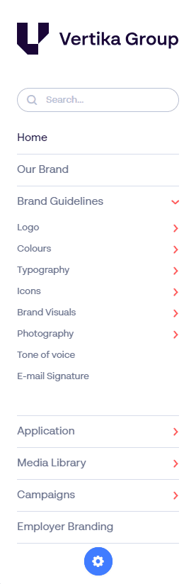
Left navigation is often used in documentation heavy setups where you want it to look like the index of a book.
Search: Define a search page. Add a search inquiry here and display the result on the linked search page (Dam view).
Navigation links: Items visible in navigation is managed trough “page admin”. Use the “drop down” arrows to expand and show more content.
Configure (cogwheel): Cogwheel opens an editor interface where you can change the look and feel of the navigation. This cogwheel only appears while in “edit mode”. Read more on this below.
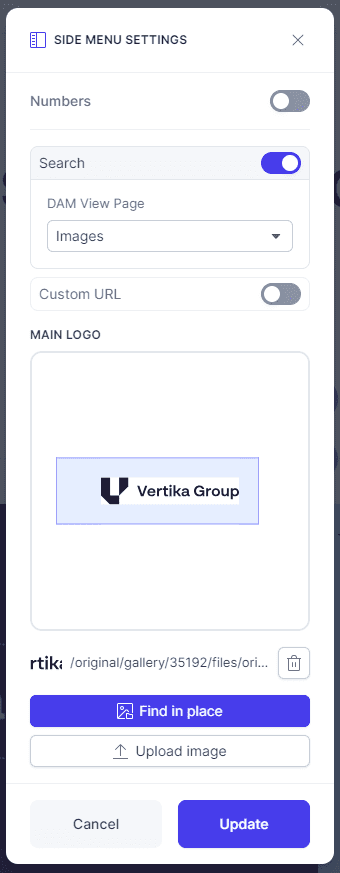
Editing settings for left navigation
Clicking the configure button (cogwheel) opens a view where you can configure various settings of the navigation panel. Note that this panel applies changes to general look and feel. To manage page visibility and what items are in the navigation, you do this in the “page admin”
Keep in mind, Changes you do may affect all pages in the portal.
Numbers: Adds a number to all pages to help show the different levels. Top level is 1. First sublevel is 1.1 etc.
Search: Enabling this, displays a search box in navigation. Connect this to an existing search page (Dam view). Users entering a search will be forwarded to this page with their search prefilled.
DAM View Page: If search is enabled, make your result page selection here. Page must be pre created with “DAM view” component.
Custom URL: Logo in navigation will link to this location. If this remains empty, clicking the logo will send users to the current “home” page in the portal.
Main logo: Select which logo you wish to display on the navigation pane.
Spacer: If you hover your mouse over this line, you can manually alter the space around it in navigation.
Logo picker: Two options to select what logo to display. Find in PLACE opens the archive where you can find your already uploaded logo. “Upload” allows you to upload a logo to display here. We recommend uploading the logo into archive first, then selecting a logo. Ensures you manage file size, placement and version.
Update: Clicking update will publish the changes into portal immediately.
As Adgistics is now part of Papirfly, the Adgistics website has been retired. You have been redirected to Papirfly website where you can learn more about our AI-powered DAM and enterprise design templating solutions!